
Brand identity
Program Partners Brand
Our visual identity reflects the precision, integrity, and strategic clarity we bring to every infrastructure engagement.
Our Identity
The Program Partners brand is built on a foundation of trust, expertise, and a deep commitment to delivering outcomes for government and industry clients across Australia.
Our visual language — from typography to colour — is designed to communicate authority, clarity, and a forward-looking perspective on infrastructure advisory.
What our brand stands for
Precision
Every detail of our identity is deliberate — reflecting the rigour we apply to complex infrastructure programs.
Integrity
Our brand stands for honest, independent advice — free from the conflicts that constrain larger firms.
Clarity
We communicate complex ideas simply and directly, both in our work and in how we present ourselves.
Partnership
Our name says it all — we work alongside clients as genuine partners, not just advisors.
The mark
A symbol of partnership, progress and purposeful delivery.
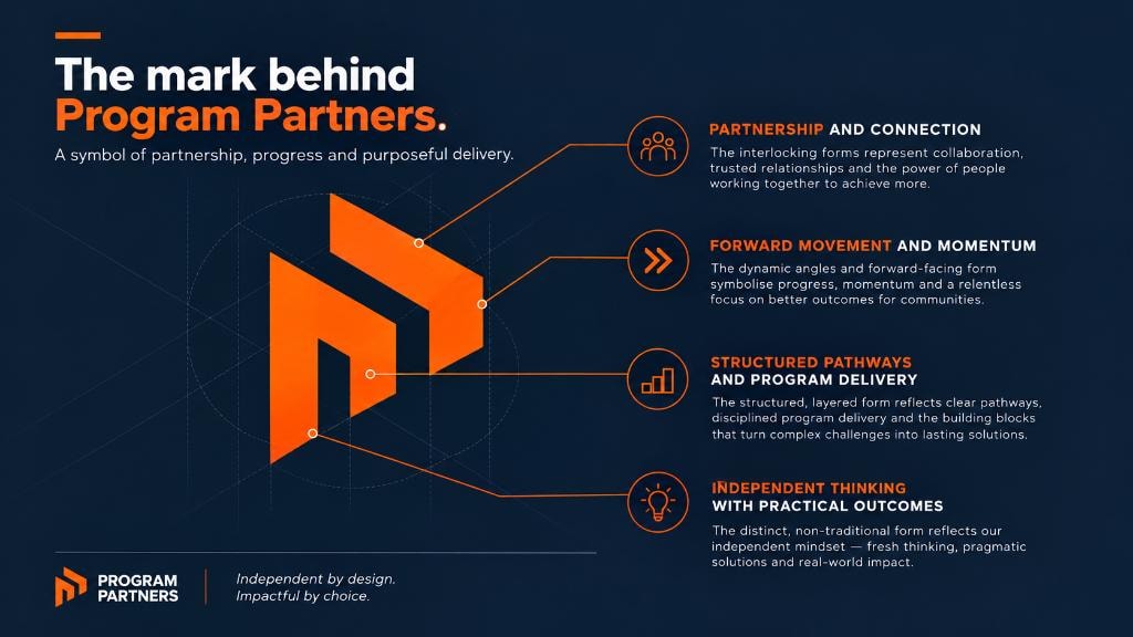
Partnership and connection
The interlocking forms represent collaboration, trusted relationships and the power of people working together to achieve more.
Forward movement and momentum
The dynamic angles and forward-facing form symbolise progress, momentum and a relentless focus on better outcomes for communities.
Structured pathways and program delivery
The structured, layered form reflects clear pathways, disciplined program delivery and the building blocks that turn complex challenges into lasting solutions.
Independent thinking with practical outcomes
The distinct, non-traditional form reflects our independent mindset — fresh thinking, pragmatic solutions and real-world impact.

Work with Program Partners
Discover how our advisory capabilities can support your next infrastructure program.